

Photo by Monika Kozub
Pleasure, humour and education.
Rico y Bonito
2024 / Mexico
Sexual education
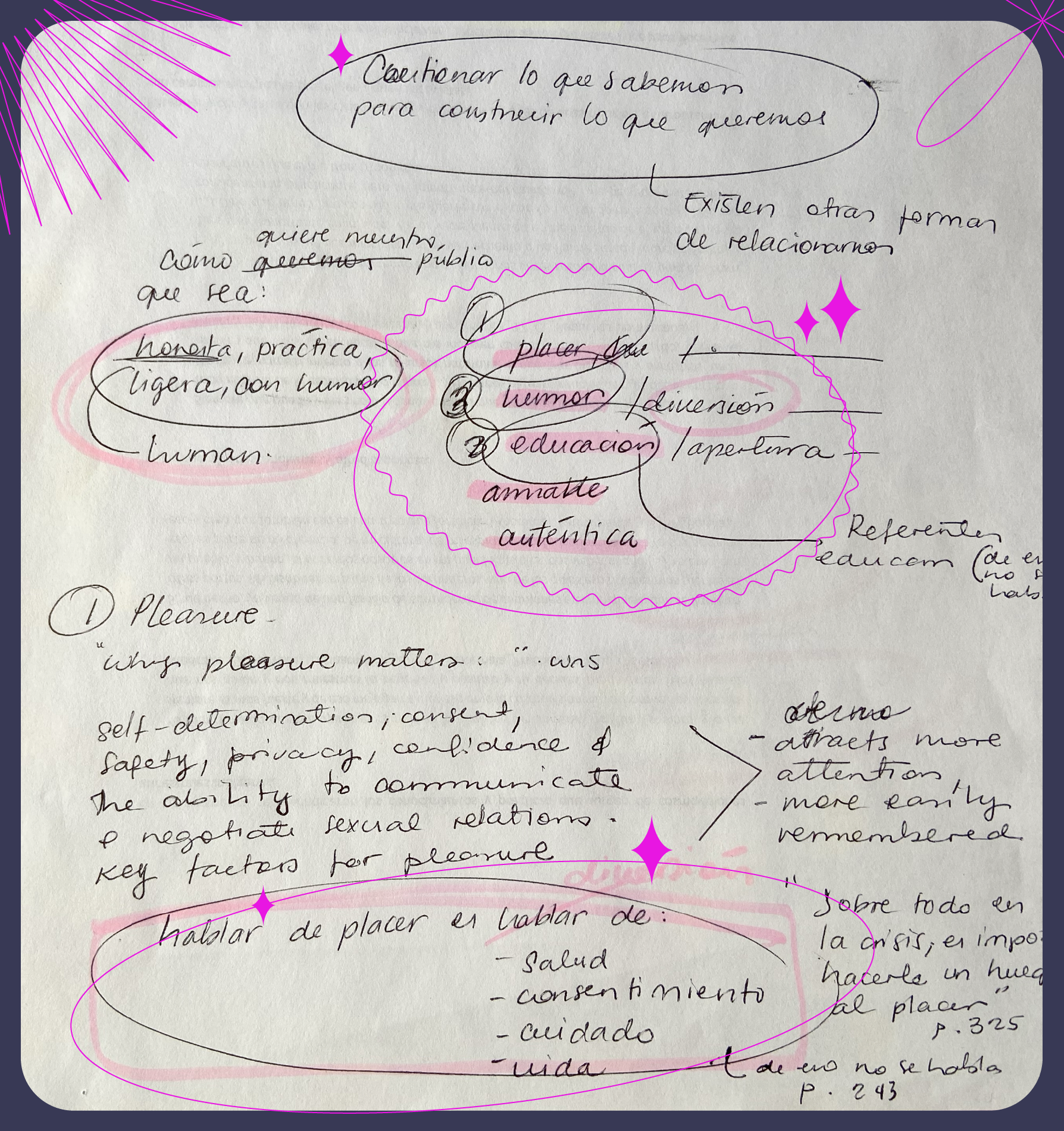
Rico y Bonito is a platform for dialogue and learning about how to approach human relationships in an authentic, pleasurable, and healthy way, questioning what we think we know in order to build what we want.
Services
Branding.
Research & Insights / Logo design / Visual identity system / Brand guidelines / Social media guidelines / Studio Look & Feel
Graphic Design.
Social media promo designs / Social media templates
Challenge.
The challenge was to create a brand for a platform that discusses sexuality, kink and relationships without falling into either extreme: overly academic or sensationalist.
The identity also needed to be flexible enough to support multiple formats, including podcasts, video, social media and workshops.
Process.
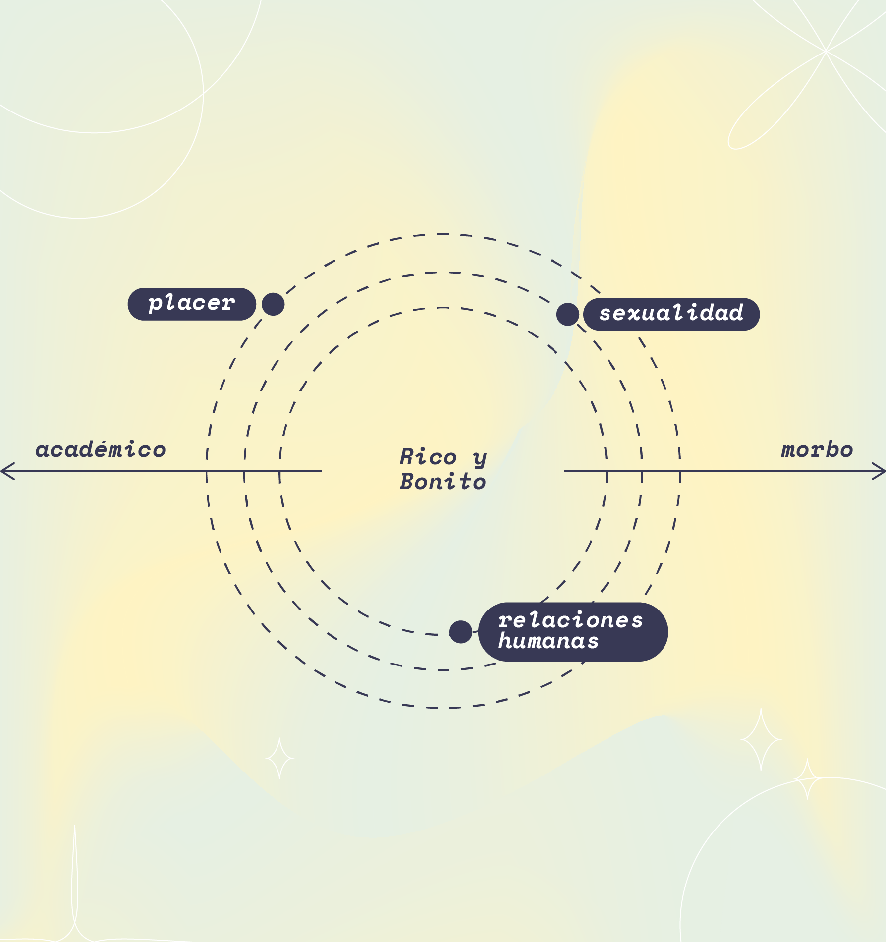
To understand how Rico y Bonito should communicate, I mapped the project across subject matter and tone.
The platform sits between expertise and accessibility: grounded in knowledge, but expressed in a human and approachable way.
This led to a key discovery:
Rico y Bonito is pleasure, humour, and education.
But talking about pleasure also means talking about health, consent, care and life.
The brand therefore needed to feel honest, practical, sexy, light, fun, human and open to dialogue.
Solution.
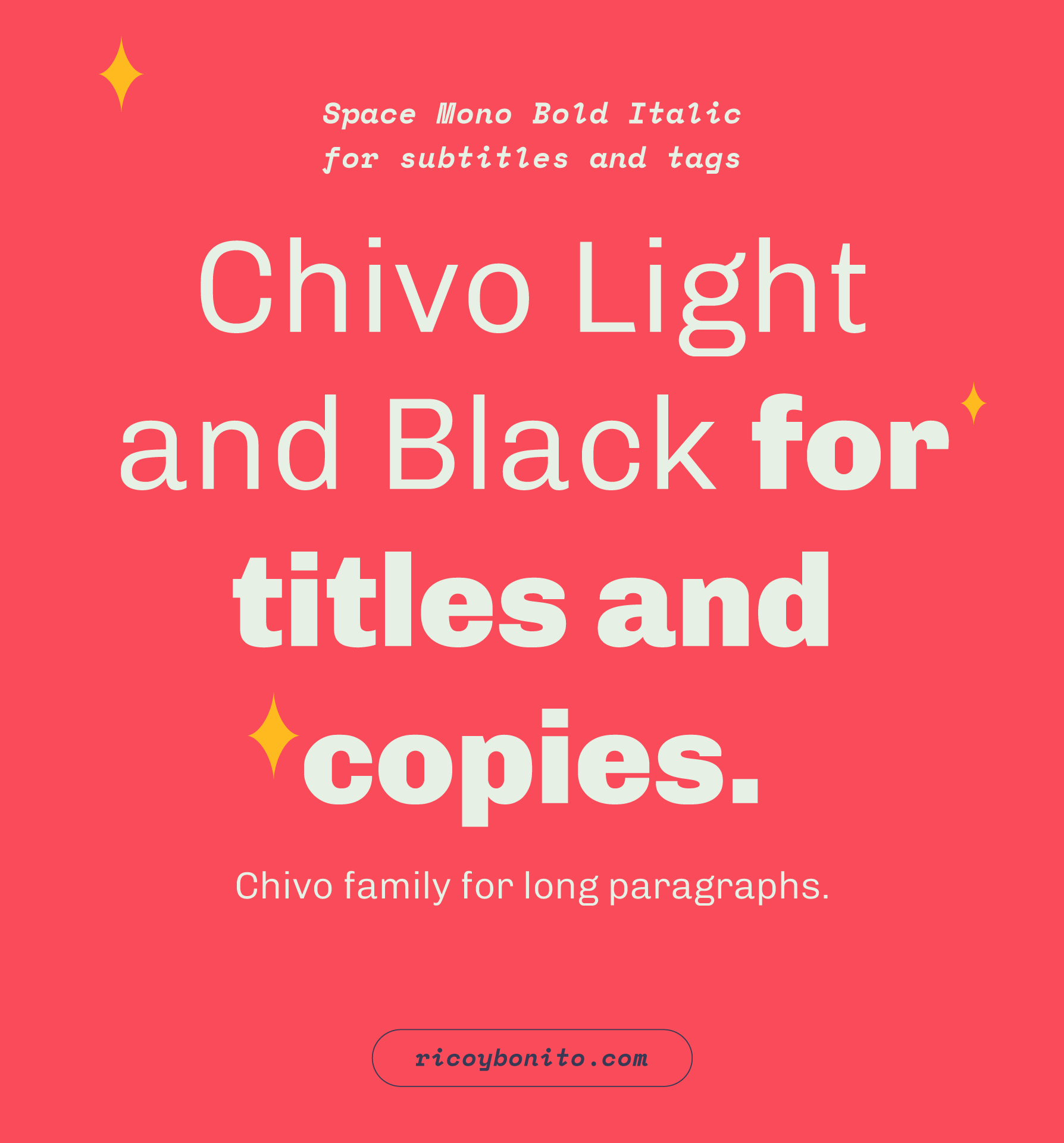
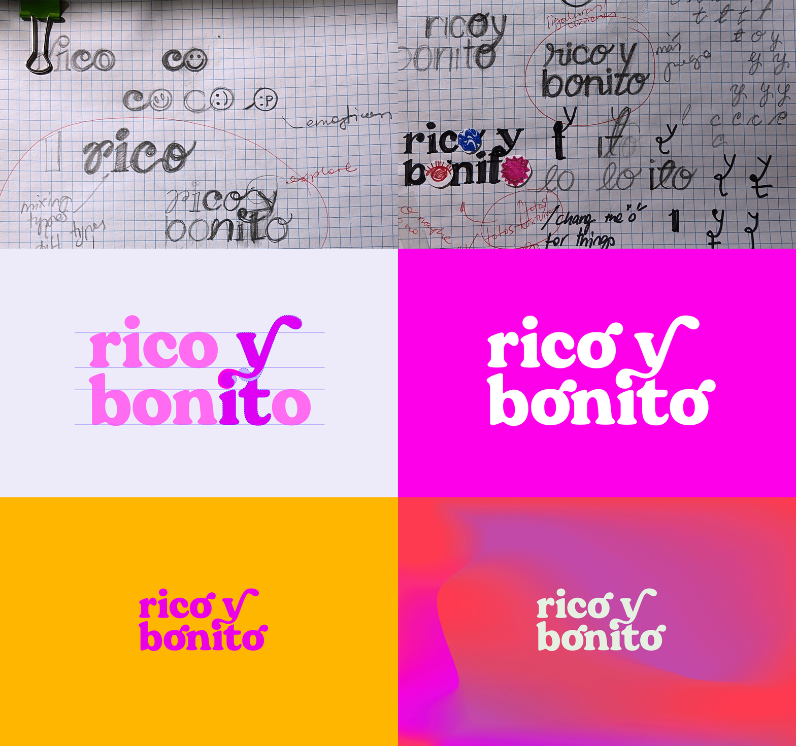
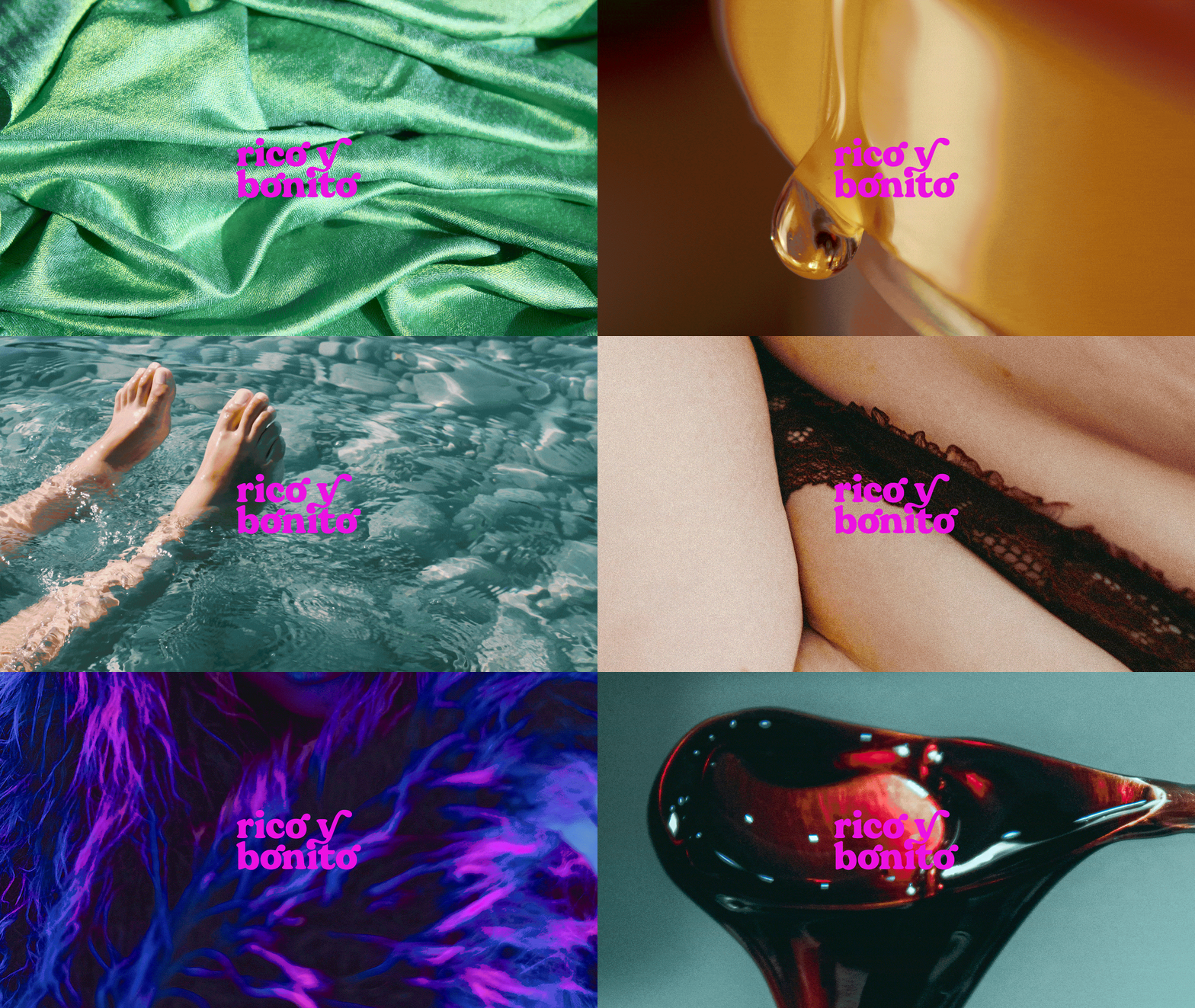
With curved strokes, no right angles, and ligatures, the chosen and customised display typeface gives the logo a unique sexy feel.
The visual language focuses on textures and sensations. Close-cropped photography highlights skin, folds, surfaces and details, inviting the viewer to look closely and experience the image beyond its literal subject.
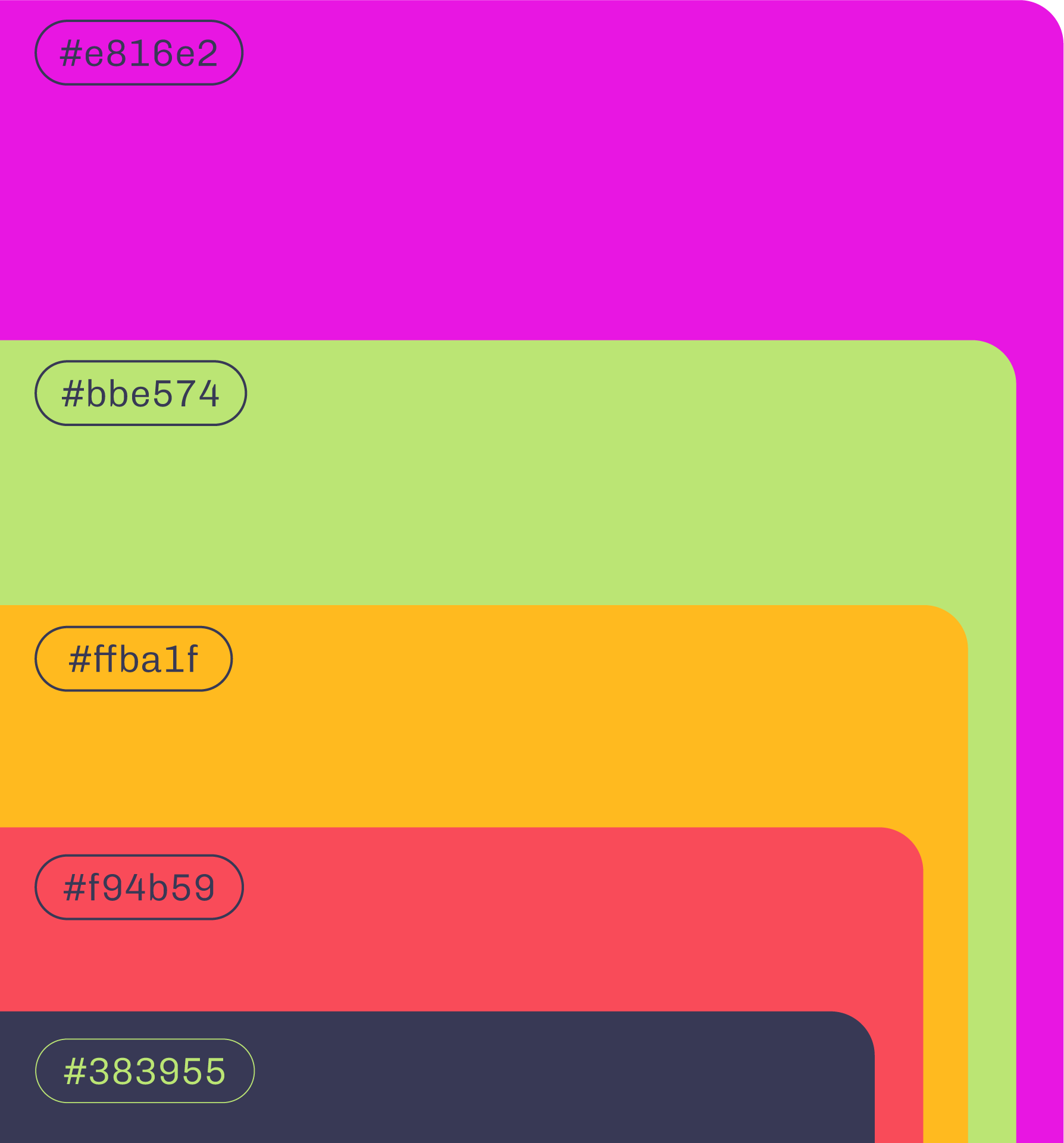
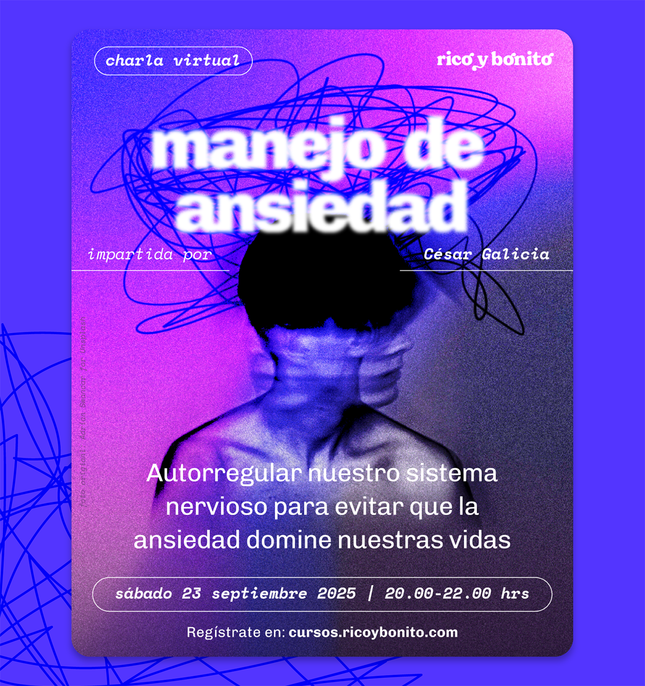
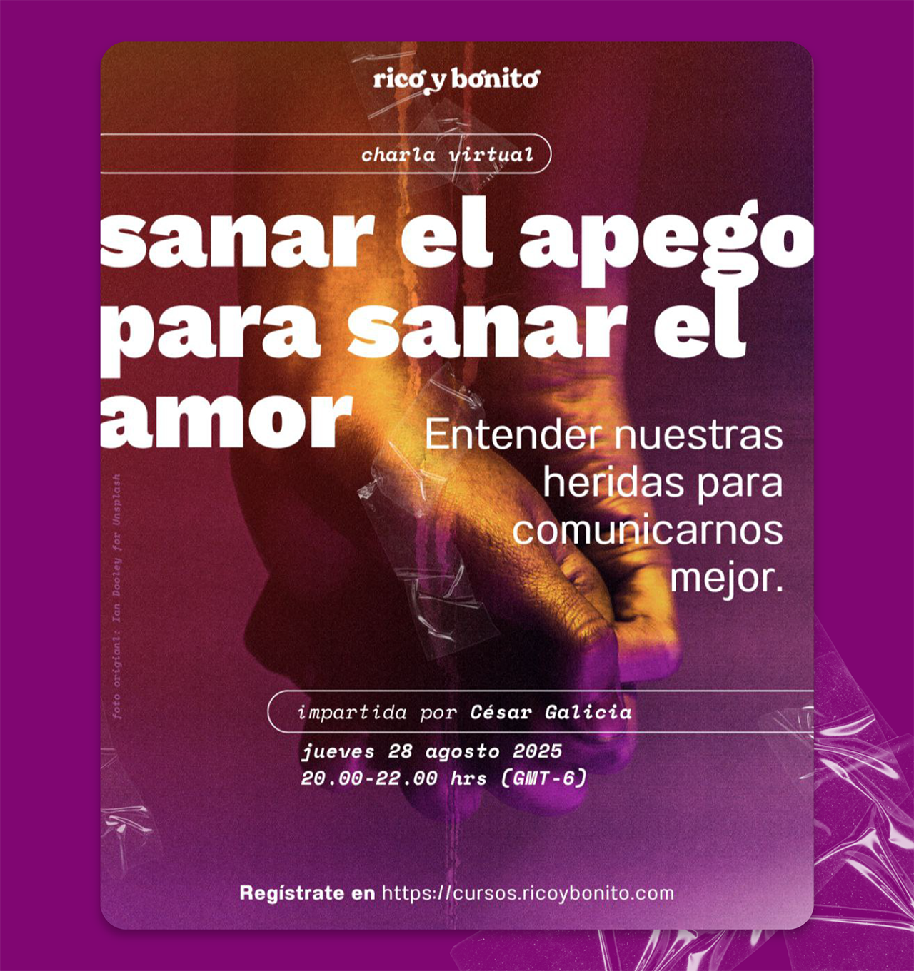
A flexible system of colours and gradients moves fluidly across different applications, allowing the identity to adapt to a wide range of themes and formats while remaining recognisable.
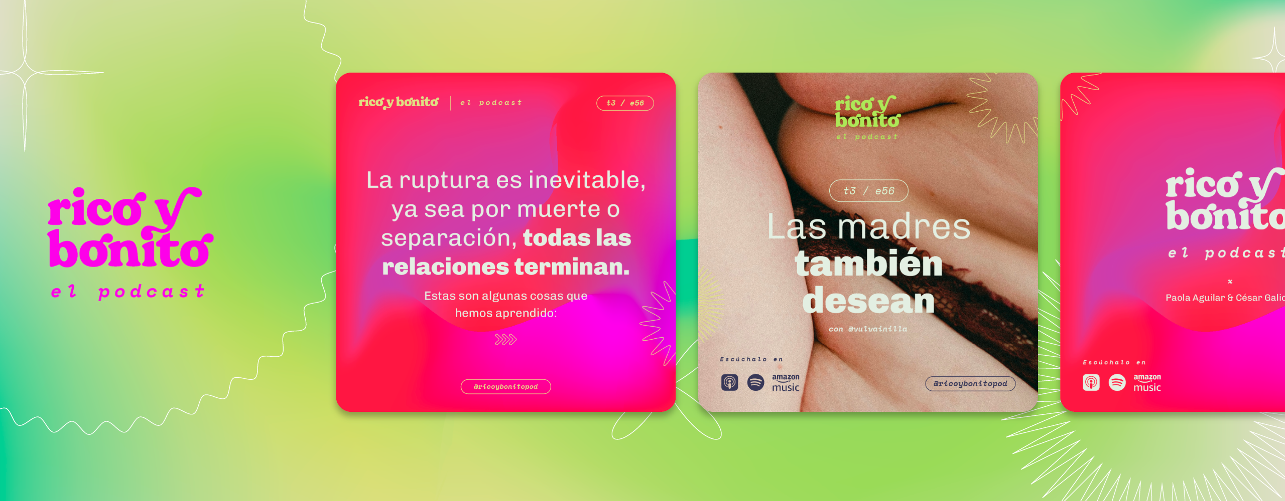
Together, these elements create a visual language that balances credibility with humour, pleasure and the complexity of human experience.
Question what we know to build what we want.
Find out more about Rico y Bonito in their instagram and listen to their podcast in any platform.

Get in touch.
hola@citlallidunne.com
Instagram →
Linkedin →
