
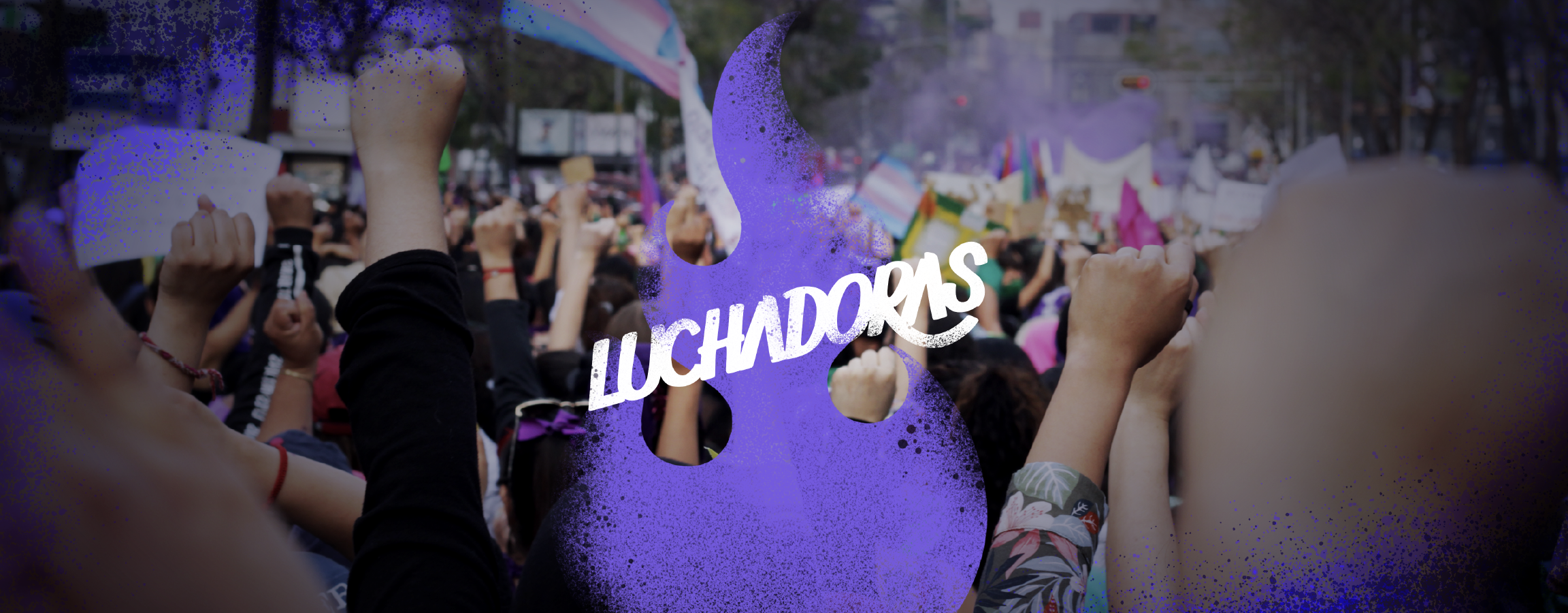
Photo by Samantha Pantoja
A trans-inclusive feminist collective inhabiting and contesting public and digital space.
Luchadoras
2021 / Mexico
Digital rights, feminist technology and social justice
Luchadoras is a Mexican transfeminist collective fighting for the right of women and gender-diverse people to live with joy, freedom and safety, both online and offline.
Services
Rebranding.
Research & analysis / Conceptualisation, logo design, brand guidelines, brand look & feel
Art direction.
Front-end web design supervision
In 2021, in the midst of the pandemic, Luchadoras needed a full identity redesign. The collective was no longer the same as it had been years before: it had changed not only visually, but from within.
The project required an identity that could speak to its history, its present, and the way its struggle unfolds across both digital space and the streets.
Challenge.
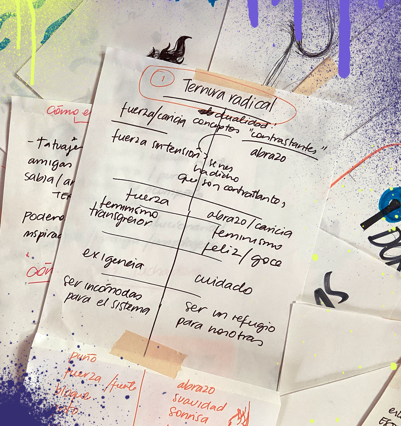
How do you represent a transfeminist collective, with both digital and physical action, without falling into the traditional imagery of feminist activism?
How do you speak about a collective that is transgressive, disruptive, loving and wise?
The challenge was not only to find a middle ground between apparently opposing ideas, but to represent the organised rage of a collective that had spent years working, accompanying others and weaving its place within the activist world.
Process.
Luchadoras was coming from an important internal process, where they had reviewed their history, their present and their future. A transformation was taking place from within, and the identity needed to respond to that.
We needed to speak about technology, digital territory and online care, but also about the street, protest, body, community and collective presence.
We embrace our rage and our fire; we defend it and let it burn.
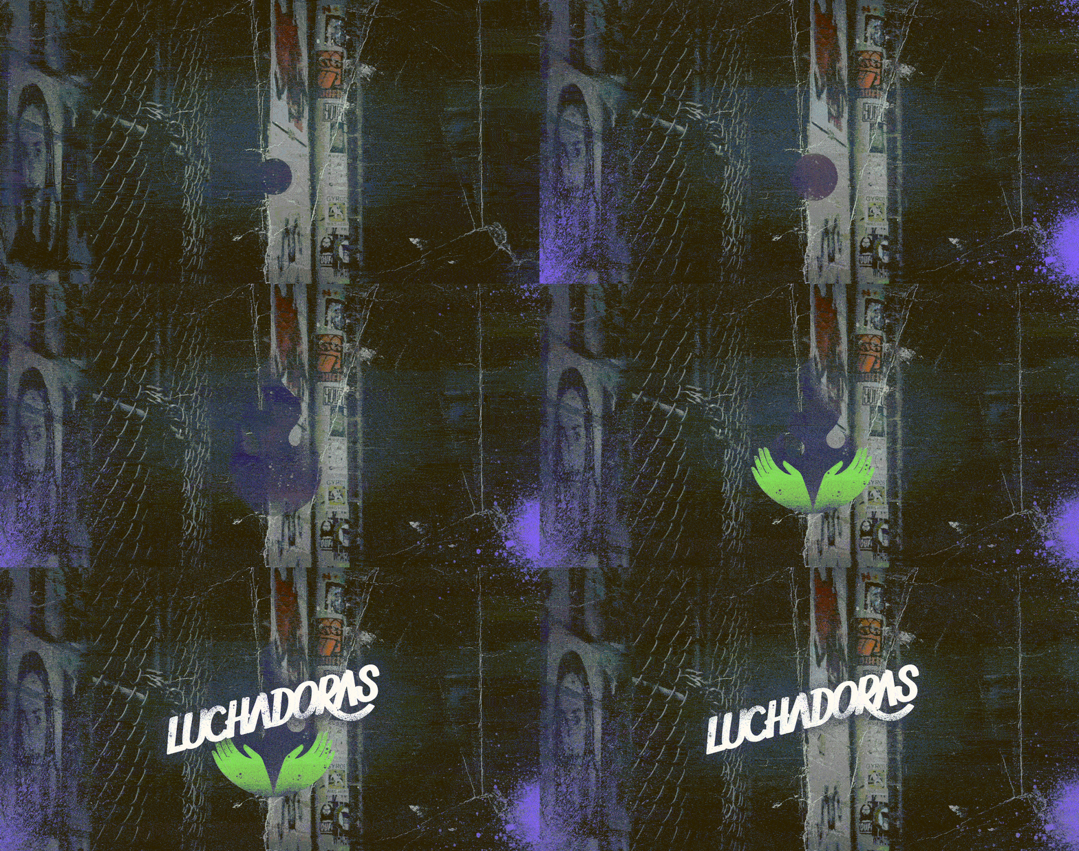
Radical tenderness became the concept that allowed us to build the new identity: an idea of refuge, home and care amongst ourselves, but crossed by an organised, transgressive and explosive rage.
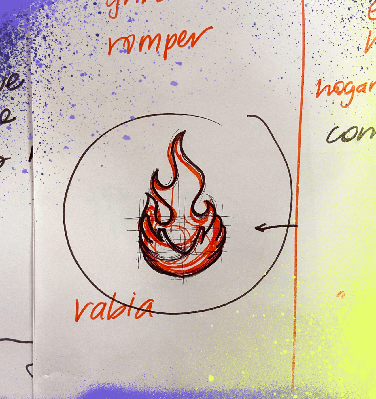
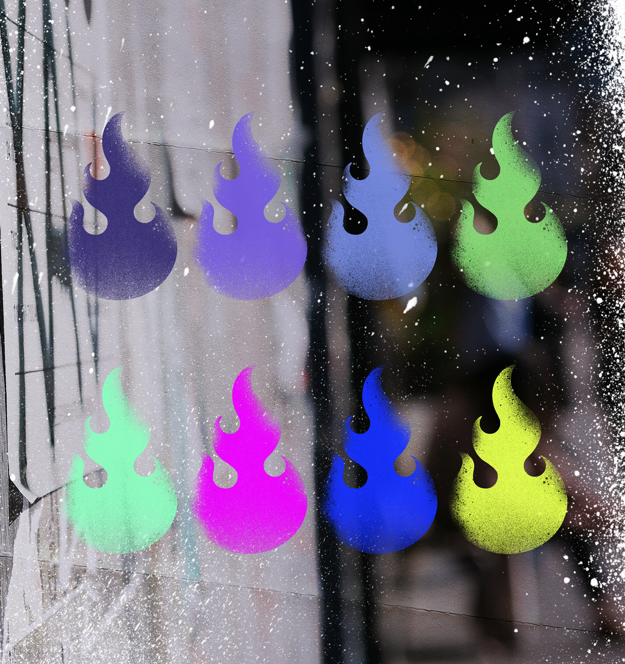
Fire emerged as a central metaphor: something capable of destroying everything, but also of giving warmth, opening up space and allowing reinvention.
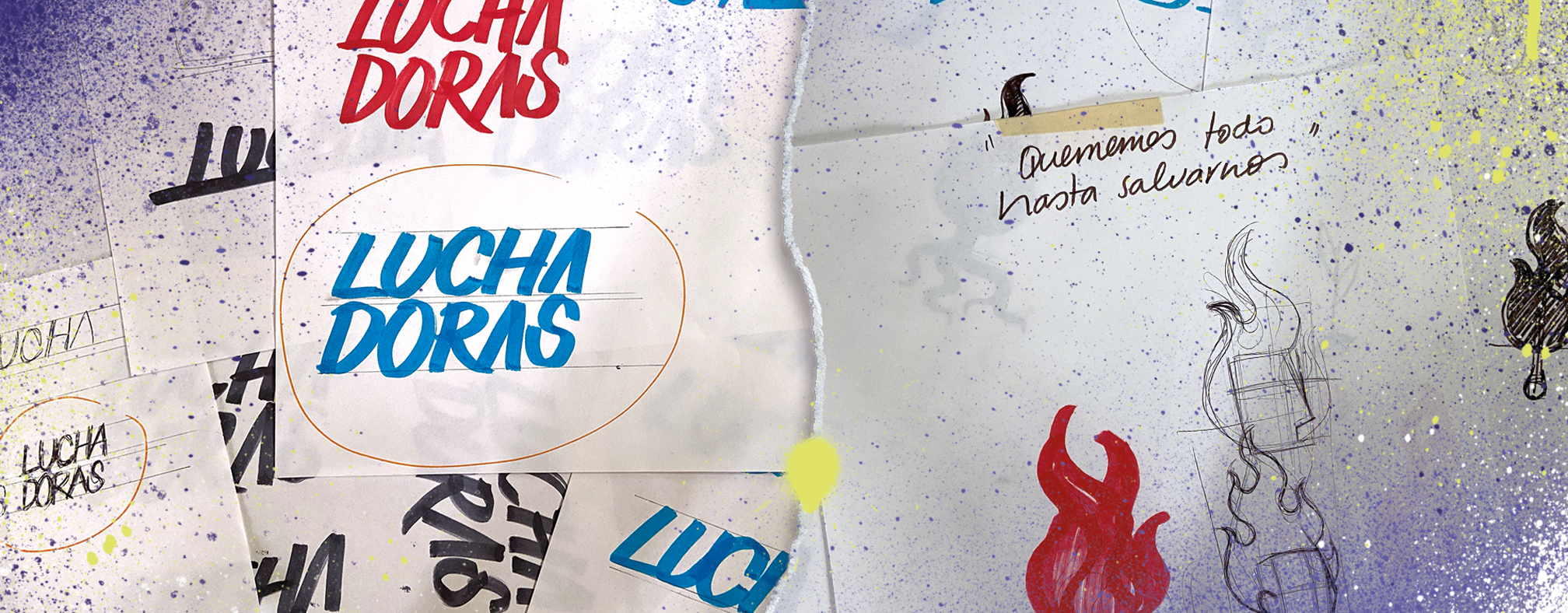
The visual language of marches, protest markings, graffiti, paste-ups and the gestures of public demand also became key references for building an identity with strength, memory and presence.
Solution.
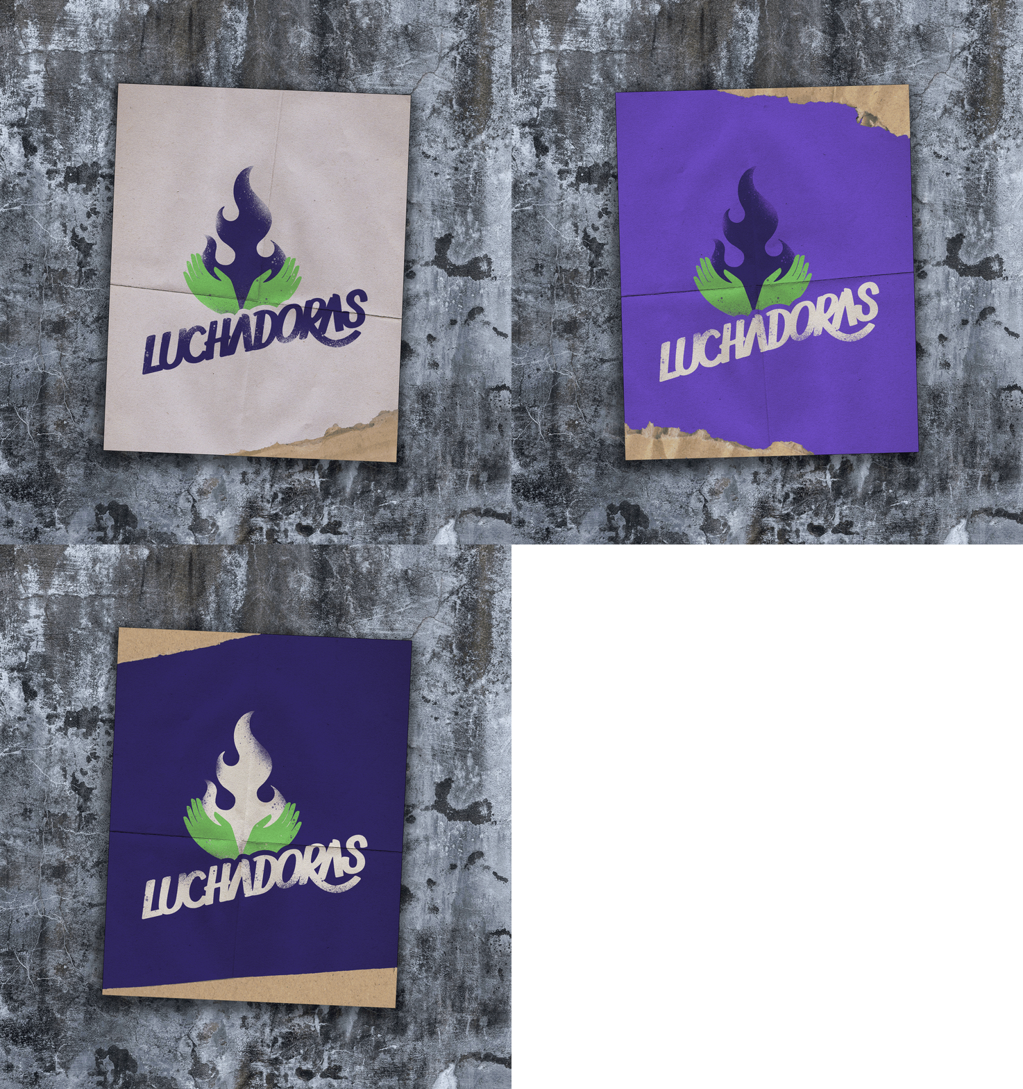
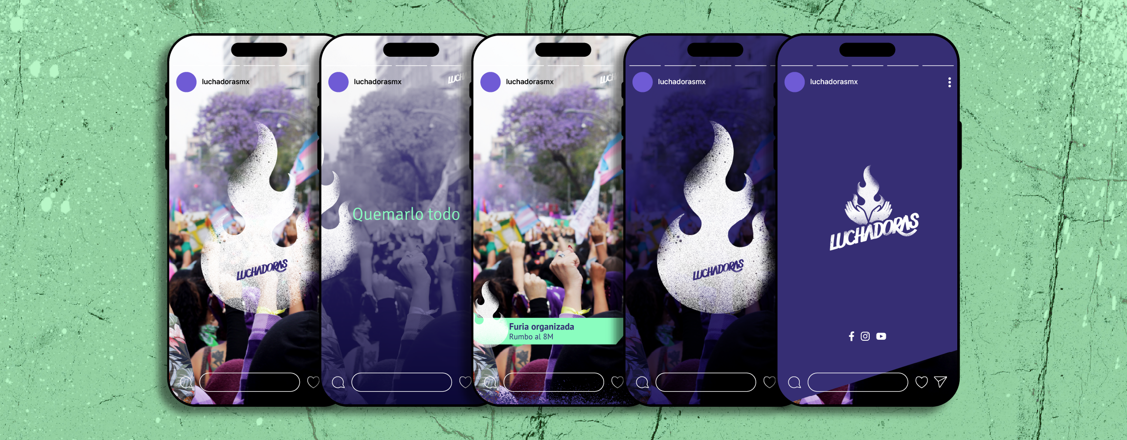
The identity is built around two main elements: lettering and icon.
The lettering references protest markings and posters, while the icon works as a rebellious embrace: an image where rage, care and collective holding coexist. Spray and graffiti textures connect the identity to street struggle and to a visual language that feels alive, urgent and expansive.
The colour palette begins with violets and greens, referencing feminisms and the fight for the right to make decisions over our cuerpas (bodies). Brighter colours, linked to the digital sphere, expand the system and allow it to adapt across different formats, campaigns and materials.
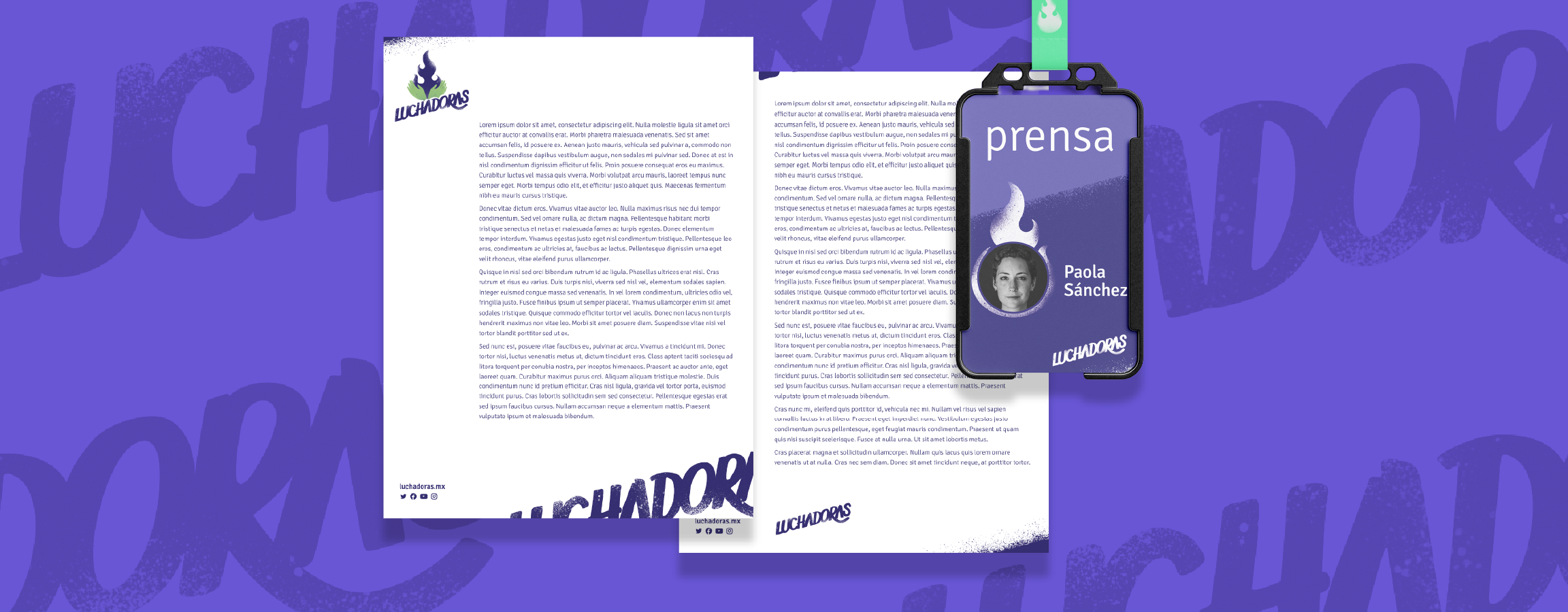
The graffiti-inspired visual language opened up a flexible, expressive and ever-moving system: an identity able to hold messages of care, denunciation, rage and community without losing strength or coherence.
Fire has the power to destroy everything, but also the power to create.
Follow Luchadoras’ work on their website or their socials.
Studio project at Fósforo
Graphic design
Carolina Lara
Web design & development
Carolina Lara
Fernanda Arellano
Rodrigo Serrano
Get in touch.
hola@citlallidunne.com
Instagram →
Linkedin →
